Third Go Around

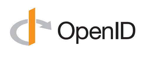
I’ve been displeased with certain aspects of the OpenID logo as it stands for a while. The orange is too reddish, the perspective of the o/d curve and arrowhead have always been wrong, and the type is too tightly kerned, light and, well, orange.

Additionally, it’s always worked poorly at small sizes and completely fails to work in monochrome. One school of thought says that the shape is the most important aspect of a logo. The colors, if there are any, should be secondary. The first two iterations used an outlined version of the o/d curve. This time I thought a gap would work better. Turns out it solved both problems at once, as well as strengthened the the I character that anchors the glyph.

OpenID Logo (v3)

Changes:

  • Added gap around ascender for small and single-color reproduction.
  • Gap increases in size when shape is scaled down.
  • Stem: Increased ascender height; reduced isometric perspective.
  • Arrow: Rotated, reshaped, non-square.
  • Type: Increased letter-spacing; Helvetica Neue Regular (vs Light).
  • Color: Darker gray for curve/arrow; Pantone DS 32-1 C for stem; black for type.

Visual comparison of v2 and v3 (PDF).

Comments

January 15
4:05 PM

Edit

Snorri writes:

Dear Randy,

Congratulation for this update... I know the design work and what may appear as a small change ... Is often a complex work!

I like the new "light orange" and "the space" between the arrow and the "I" = Yes more visible + more modern.

But IMHO = I'm no sure that 3 colors; orange + grey + black is a good idea! Because is less "design" and because OpenID is now remembered throughout the world as the color "orange" ... Black is not a strong color for a logotype (is Neutral)...

I think it would be better to write OPENID with the new orange (or grey) why not "Open" in grey and "ID" in Orange" but please not in Black! = It would be a mistake! (Sorry it’s my opinion)

Thanks for your work for the OpenID Community

January 15
6:44 PM

Edit

atom writes:

Now it would be even cooler if I could sign my comments on your blog using OpenID!

January 16
9:34 AM

Edit

Hans Granqvist writes:

I like the changes of the graphic. You have a good eye.

Could you give some background to what the stem and the arrow symbolize?

January 16
10:45 AM

Edit

ydnar writes:

The circled I symbolizes a few things: A stylized capital I, a lowercase “d” and the curve/arrow shape is supposed to convey the notion of openness and progress.